I Identified problem areas and created solutions for a more user friendly and accessible experience while navigating the websites.
UX Designer, Graphic Designer & Photographer
Microsoft Clarity, Monday, Figma
Jan – Apr 2023
I observed users on the websites and analyzed their behaviors. I researched other hotels and analyzed their navigation solutions. Combining these analysis allowed me to identify problems and work on solutions for them through sketches and wireframes. Before creating a prototype in Figma I developed simple design systems based on respective brand guidelines so prototyping would go faster and quicker to change details. High-fidelity prototypes of the main solutions were then created and discussed with the marketing team and developers.
I aimed to create identical build of the design for respective hotel so future upkeep of the websites would be more efficient.
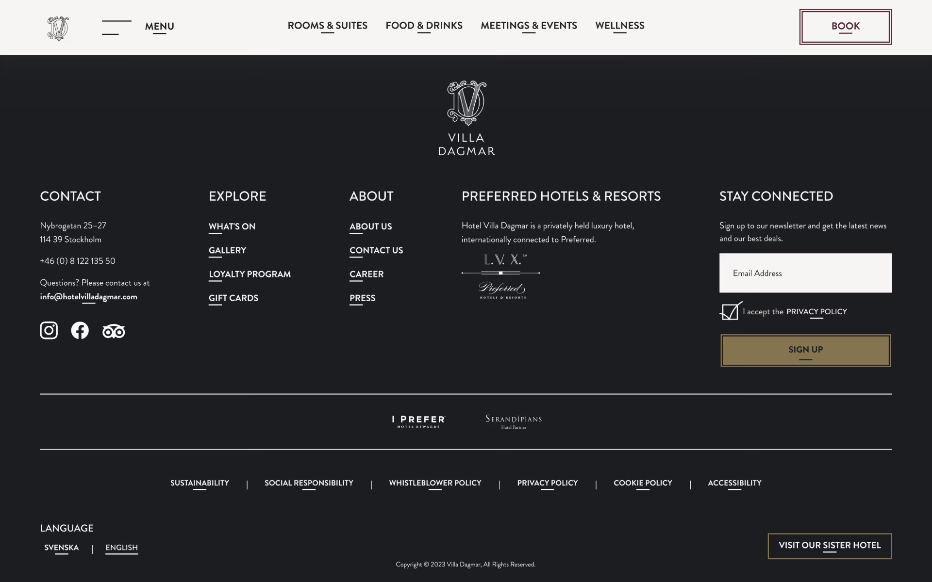
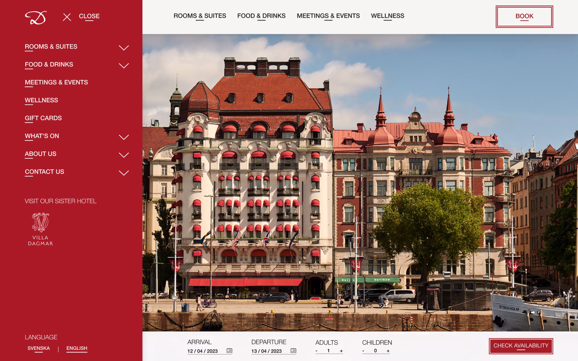
Users spent a long time searching for information they were looking for as it took several tries navigating the hamburger menu or scrolling the websites card menu before they found what they were looking for. Links that usually are found in the footer made navigating the hamburger menu more difficult and time consuming.
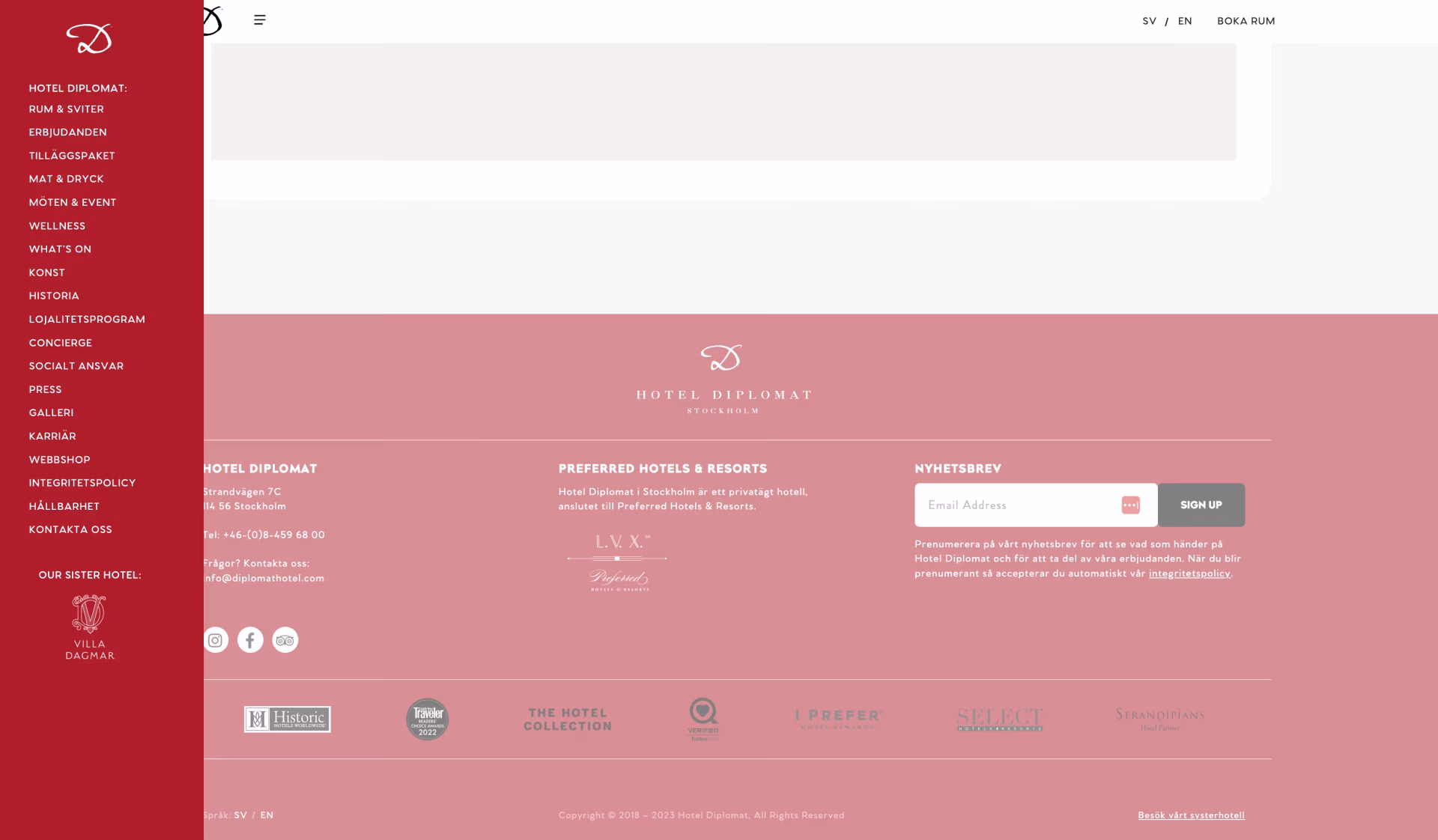

Picked out main links that users mainly looked for and made them accessible directly in the navigation bar and added sub-links to declutter the hamburger menu for easier navigation. Moved links from the menu such as policies that are usually found in the footer to the footer only.
In mobile view the book button and language alternatives are shown in the hamburger menu and the only thing in the navigation bar is their slimmed logo and the hamburger menu icon with menu text.
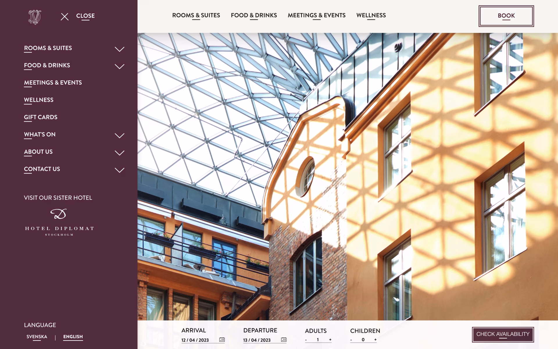
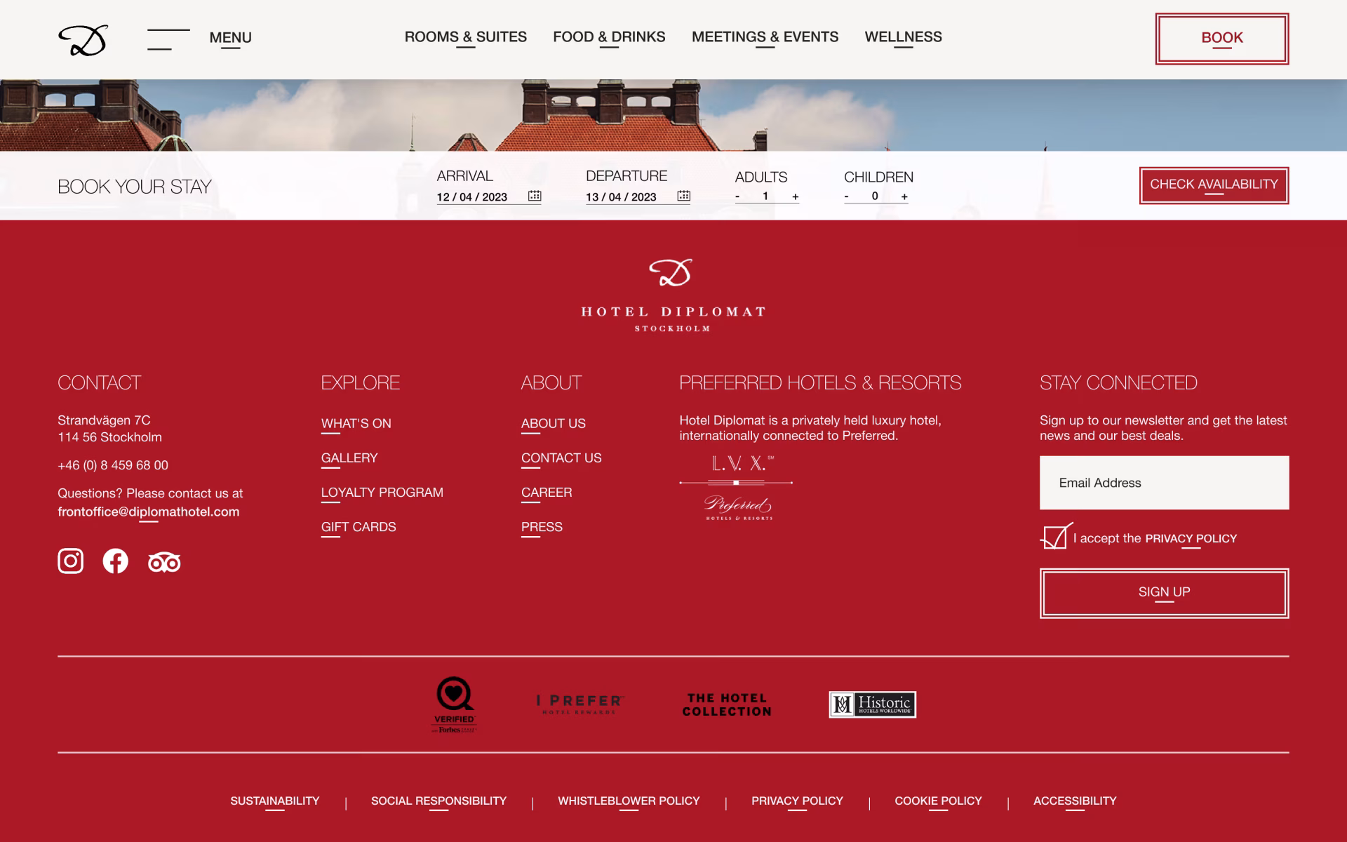
Added two columns for menu links in the footer that are not main links but still might be interesting links for users to see and might expect to find in the footer. Added a row for links such as policies which are usually and expected to be in the footer.
Made the ‘visit our sister hotel’ link to a more visible yet subtle button so it could stand out from the row of links.


Users spent too much time looking for how to book a room and did not always notice the link in the navigation bar. They also had a hard time finding a button for booking once they had decided to book something as not every page had a “book meeting” or “book table” button. They would in frustration look around and would in the end go back to the home page to find booking buttons there or go to the specific pages about what they wanted to book.


Replaced the previous ‘book a room’ link with a ‘book’ button in the navigation bar. This way users can access booking for a room, a table and a meeting/event room across the website.

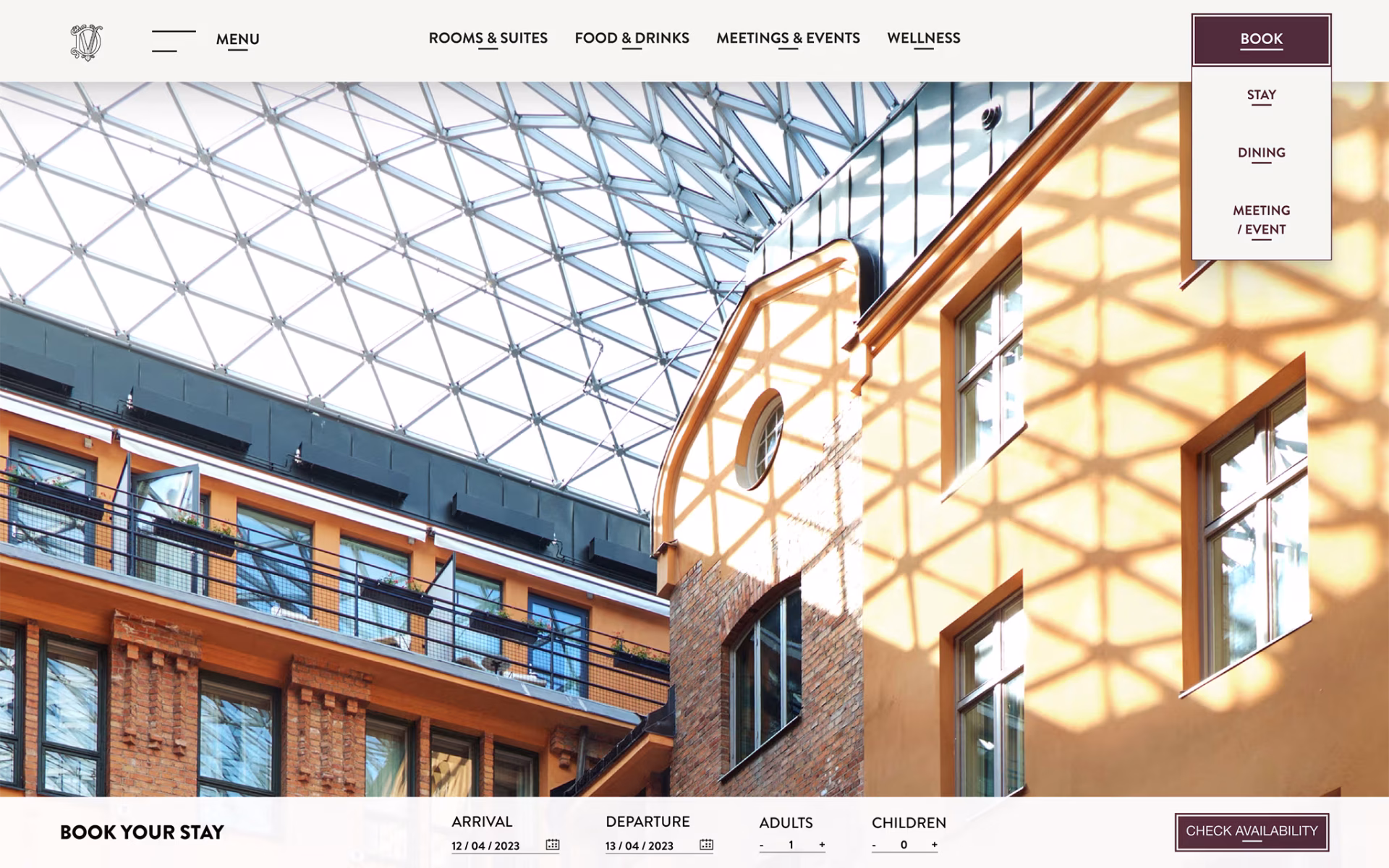
Added a ‘Book Your Stay’ bar at the bottom of the page that would appear once the user scrolled on the website so the user can begin the booking process from wherever and whatever page of the website they are on.
The idea is that the ‘Book Your Stay’ bar will follow when the user scrolls sitting at the bottom of the page but will not go further than to the top of the footer as not to cover any information and to clearly mark the end of the page. If the user scrolls up again the bottom bar will once again follow the user scrolls sitting at the bottom of the page.
In mobile form this is translated to a button that acts in the same way, but will open an overlay over the current page.


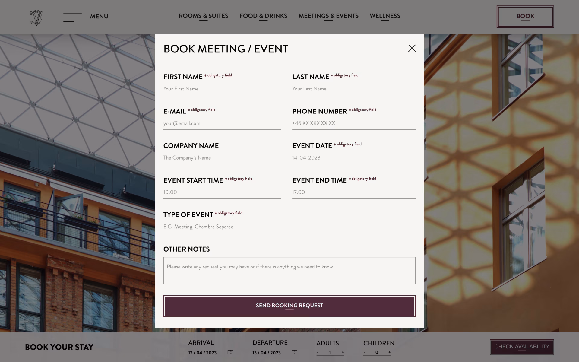
When booking a meeting room users could not tell where they were supposed to fill in their information and had to guess where the input field was. Users did not immediately find the submit button that was weirdly placed above ‘other notes’ to the left instead of a more intuitive placement at the bottom.
Created more clear input fields for the form with placeholder text and placed the submit button at the bottom.
For a smoother booking process, I added an input field so users can fill in what type of event they are booking for. This way they can receive relevant information for the type of event quicker, e.g. what services there are to add or room recommendations.

Users could not actively accept the privacy policy and could therefor sign up not knowing that they were accepting the privacy policy. This is not good practice from an accessible view.
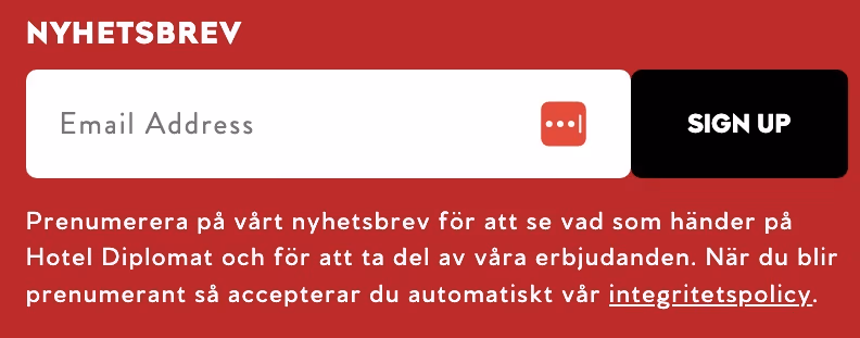
I added a checkmark so users can actively accept the privacy policy when signing up to the newsletter so it is clear they are aware of the choice they are making.